Second Brief: is "Earth Artifact" and the voyager golden record.
I found it difficult to think of ideas for this project as its quite vague but I have produced a book of research and development of 3 ideas, I have produced 2 final designs for one idea and another final design for a different idea I am not sure which one is better so I made both. I will post my books on Issuu.
Sunday, 22 February 2015
Final Design City in Flux
Final Design
These are photos of sculptures I made with my found objects in this particular instance my found objects are shoes and they are a metaphor of identity of lots of different people to represent the city. I have put all these photos into a book. Its a very Post modernistic inspired piece of work.


Saturday, 29 November 2014
Illustrator Induction: Marilyn Monroe
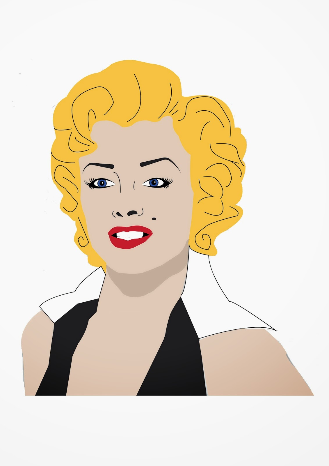
I have created this image by using adobe illustrator, using mostly the pen tool, the eyedropper tool, the ellipse tool and fill. I think the hardest bit was the eyes and the eyebrows as it was hard to get the placement right and I had to change the profile of the shape I created for the eyebrow and the eyelashes. I am pleased with the outcome as it does resemble the very iconic Marylin Monroe and it like the colours and the shadow I created under the chin.
Friday, 21 November 2014
Urban Typography
URBAN TYPOGRAPHY
our aim was to create a collaborative urban type installation, designed from location photography taken in huddersfield. we used all the letters in the alphabet with a materialistic theme and printed the pictures on acetate and placed them on the glass window to create a wall of type which will let light pass through to highlight the letters.


After Effects: first making of video

The window in the top right hand
corner is where you import the images and the copyright free audio. We first
imported the audio and then we dragged the audio down into the window at the
bottom, we did this with the images after we made layers of colours, which
would be replaced by the images or placed in between.

This is where you can play back
your video you are creating and also you can use this buttons to repeat,
forward and reverse the video. This allows you to analyse your on work while
creating it.

Where the red line is you can move
the icon at the top and press the asterisk to make a marker at the top help you
know where the beat of the audio is and therefore line up the pictures with the
beat so it flows better. You drag the purple bar to left or right to move when
the pictures are to appear.
Tuesday, 11 November 2014
Tim Marrs


typography


Subscribe to:
Posts (Atom)