Wednesday, 27 January 2016

Cinema4d as a design tool

We firts started with a logo design created in illustrator and saved it as a illustrator 8 file and then merged it into cinema4d . Mine was one object. So we set up some settings.


We then had the object and pressed green round cube within a cube at top and put an extruder on the object this was to create the 3D effect.


we then changed the caps on the extruder to 3 steps and 1 mm radius.
then we used mograph menu to et the monotext tool as a way to show how to do text instad of importing it.
we changed the settings to the size and depth we wanted.
then we created a material by clicking twice in low bar and creates a solid colour and dragged it ontop of layer we wanted each to be a certain colour.
then we messed around with the logo to get it to wat we wanted and then rendered it by pressing the third orange button. we had to change some of the settings which you can see by these screenshots i took.


A scene movie

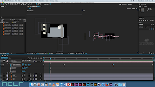
We created our own piece of work in illlustrator to demonstrate a scene for example an urban scene in the city, or a landscape in the countryside. This was created in illustrator and each layer was made bigger then the shown screen to allow the effect we intended to use to work. These screenshots show the process i went throught to animate this scene by giving each object wether it was in the foreground or background an effect of a roll on. This made the scene much more interesting to watch.


We created the composition settings.

 Then we imported all files into the composition 

 We changed th view to 2 views.
 We added a camera and changed the settings for it.
 We layered the lines on the right to be more spaced out so itwould determine when camera would see specific objects within the scene.

 We changed the camera settings to 50mm.


 We placed camera at top of the screen then animated it to move back so the effect could take place.
 
by using key frames on the camera layer of the position i created an effect where the camera looked as though it was moving up and down over the fence in my scene.

cinema 4 d workshop

Cinema4d software experiment from louise fielding on Vimeo.

I did a workshop using cinema 4 d software and it was the first time i have ever used this software so i found it difficult to get to gripswith it but managed to produce this short video show-casing the work by importing the produced products from cinema4d.


Monday, 25 January 2016

Typography


This is the large scale of one of the many typefaces I tried, I did a large scale of this because i thought it was the most unique idea and a bit different. I am quite happy with the result i got i think aybe i could improve it by photoshopping some colour in it or maybe putting it up and let people colour it in as a sort of experiment.

Cereal Box Design


This is the finished designed cereal box with the character i designed this has been printed out and will be stuck together to from a little cereal bos at the right size as they sell in the shops.

Project management

Time, cost and quality triangle, these varely rarely coincide and it's a trade off between these three things, and depending on what client wants this will change. There are 3 distinct elements the design phase, execution phase and implementation phase.

Design phase: this covers all aspects related to design, research, idea generation, design concept, design embodiment, technical completion.

Execution phase: this covers all aspects related to the completion and production of the design. Technical completion, production issues print, 3D aspects, moving image, delivery etc.

Implementation phase: this covers all aspects related to the design and production once it is out in the public domain.

Always work backwards

You have to consider that everything can be done by the deadline, 1 man day Equals 8 hours, 1 man week equals 5 man days which is 40 hours, and 1 man month equals 4 man weeks, 20 man days which is 160 man hours.  You have to consider holidays, sickness and time of year, recognise your staff and yourself need a break.

Design phase this will take an estimate of a few hours on research, idea generation is 1 day, design concept is 2 days, design embodiment is 2-8 days and technical completion is 3 days. So overall you have 9-25 days to complete the design phase. In this process you also must get to client sign-off here not at end of process.

Photographic image

A series of images by Wilkie Doherty and his series should Belfast and the grain of the image: a poetics of future history in some 'new' photographs.

In each photography it is always taken from the middle of a street/ road or avenue. Doherty was influenced by w a mccutcheon who took photographs in Belfast who's asking tends to a ou using people in his photographs so Dohertys work would not look out of place in mccutcheon's archive. Doherty produced sever and isolate photographs which shows sever has been taken and cropped so you can not tell that it is Belfast as it has no surroundings and isolate then shows a bridge seperating the Catholics and non Catholics an showing the recognition of the political and religious events. The words on these photographs are whit over black and white photograph makes it look more contemporary. He wanted to show the ghettoisation of Catholics and then the same happening with gay and lesbian community and the prejudism within Belfast and shows big political changes.

All the images are closed environments, desolate and empty and he has used other photographs to build on the history of photography of his work. There is a lot of historical ghosting in his work which has a big impact on audience.

Friday, 22 January 2016

Crash book jacket design

Book jacket illustration of crash collapsing bulkheads, designing pornotopia: travels in visual culture

What is crash?

James Ballard wrote the book and it starts off he's in a car crash and meets a character called dr Robert Vaughan and he wants to die in a head on collision with Elizabeth Taylor, a small cult/ subculture of crash victims is forming around Vaughan that is focuses upon the re enactment of celebrity car crashes from which they derive erotic pleasure. Crash tests limit of readers tastes and sympathies so it provokes strong reactions as it is a dark imagination and almost psychotic.

In terms of method he attempts to produce book covers and he compares the analysis of existing covers and the ideas of what the author Ballard actual thought about these visuals of text.

Personal dimension material culture allows poyner to start collecting the book and it's covers, he liked the 'toxic beauty' of the prose, the core problem is the image makers have been defeated by crash and visual treatments are marked by incomprehension and evasion, so he doesn't see them as being the truth of the text and he thinks in some cases people don't understand what the novel is about, you get the themes but not really getting to what crash is trying to portray. Crash is openly pornographic and it's a deliberate strategy and it's to complicate somebody's response. Looking at all of these treatments what do they get wrong and right, he talks about first adaptation by Jonathan Kay in 1973 shows a jutting gear stick infront of a 3D dimensional type, Ballard describes it as 'monstrously bad' . It's important to get the context. Ballard wants an element of fantasy to it but some realistic approach as well. Ballard as well as being an author also engaged in design/ illustration and poyner suggests there's always been a technological surrealism which ties in with what Ballard wants for his novel o be realistic but have a fiction in there too.
Ballard produced his own graphic work for ambit magazine, and he shows material surrealist concerns in his own work which he tries to portray through his work to engage interpretation.

Four novels and book covers published by Ballard the terminal beach, the wind from nowhere, the drowned world, all published by penguin and poyner says there the most ballardian images to be found. They are a style of one significant thing to the novel centred and illustrated in a hard clean way quite dark but colourful covers. David Pelham designed these airbrushed illustrations, the terminal beach in poyners position terminal beach is best. The centered type is flawlessly placed and weighted in relation to the image below and the stencil typeface carries a military association that fits the subject matter of the title story. Graphic design is a form of rhetoric and one reason this image works so well is that it has been realised so perfectly, it is grounded like Ballard prose in meticulously precise observation but he has given the scene of becalmed destructive power an intensified, hyper real quality most obviously in the use of colour.

There are lots of different versions of illustrations for crash. All using different styles and methods to try and get the best design to portray the fantasy and the realism in a visual that is acceptable.

Monday, 18 January 2016

Photography Martha Rosler

The Bowery in two inadequate descriptive systems

The Bowery is an area of New York and skid row. This work has images of urban decay around the city with words describing the picture placed next to the image. She refused to objectify those who suffer from poverty or neglect. Martha does documentary photography and the difference means the there are a set of words that describe some sort of concept within the picture, she starts with words and then introduces the photograph and the words are standing in for the people and the photograph shows the environment of where these people would be. The people with no money are invisible and we don't want to see them.

Paris photo platform video on Vimeo