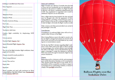
We were shown in the second session how to create a leaflet design, like the creating tab leader. We learned how to create a contents page. This is very useful for knowing how to create different layout designs for example if we wanted to create a magazine, book, leaflet, card or any other printable forms of information.
Sunday, 10 May 2015
DTP poster
Our first session in InDesign we produced the DTP poster/ newsletter. we had an A4 page on portrait, set to print.
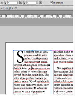
To set the first letter of an article as being larger then the others, need to turn it into a drop capital. Click anywhere in the paragraph and increase size of the drop caps settings.
We learned how to setup automatic paragraph spacing, and I got taught how to use clipping path, detect edges, so an image or object can be inserted into text with the text going around it. I got taught to do page numbers by going to type, insert special character, markers and then select current page number.
This was the Final Design. This exercise was to use all the basic and major tools to create a professional document.
Break Dance Animation
dance move from louise fielding on Vimeo.
I used the same principal as the gif and the colour animation for this video but used the brush tool to draw over the top of the real video on a new time frame. I really enjoyed making this video and I really like the outcome too, however it took a lot of time to make as it was produced by each frame separately in Adobe Photoshop.
Random Colour Animation
colour animation from louise fielding on Vimeo.
This was done in Photoshop using different layers and different frames, this is similar to the fish gif I made. it is really simple and we had to make it in a short amount of time so its really a simple example of what you can do with the brush tool and the onion skin tool on the Photoshop timeline.
Typography
This is one of my typography I created by using Adobe Illustrator. I created some other new typography, I think about 3-4 others. I created all of them by hand with a pencil and paper, I then went over the pencil in pen and then then further progressed it to creating the typography on the computer using Adobe Illustrator. Hopefully I can further progress the other types onto the computer.
Monday, 4 May 2015
Twirly Type
twirly type from louise fielding on Vimeo.
This is the second video on type we did in class. This was showing how to rotate the type and make it look 3D, we also learnt how to put textures onto the type as well. We used the rotation tool used x, y, z coordinates to make each letter turn. I like this video because it makes the lettering seem more real and 3D. however I would have improved this video by using wider letters. so a different font style so that each letter is more clear and also so that you can see the texture I incorporated into the letter more clearly.
type video
typogrphy video from louise fielding on Vimeo.
This video is the first one I've done with type, this was an experimentation with the after effects and trying to learn how the software and different tools. hopefully I can improve on this video and create my own to improve the skills I learnt. honestly I am not a great fan of this video because I messed up the ending although it is unique I tried to create a sort of rumble effect and it didn't work as well as I hoped, maybe with some refinement and practice I could perfect this and change the ending.
Subscribe to:
Comments (Atom)


