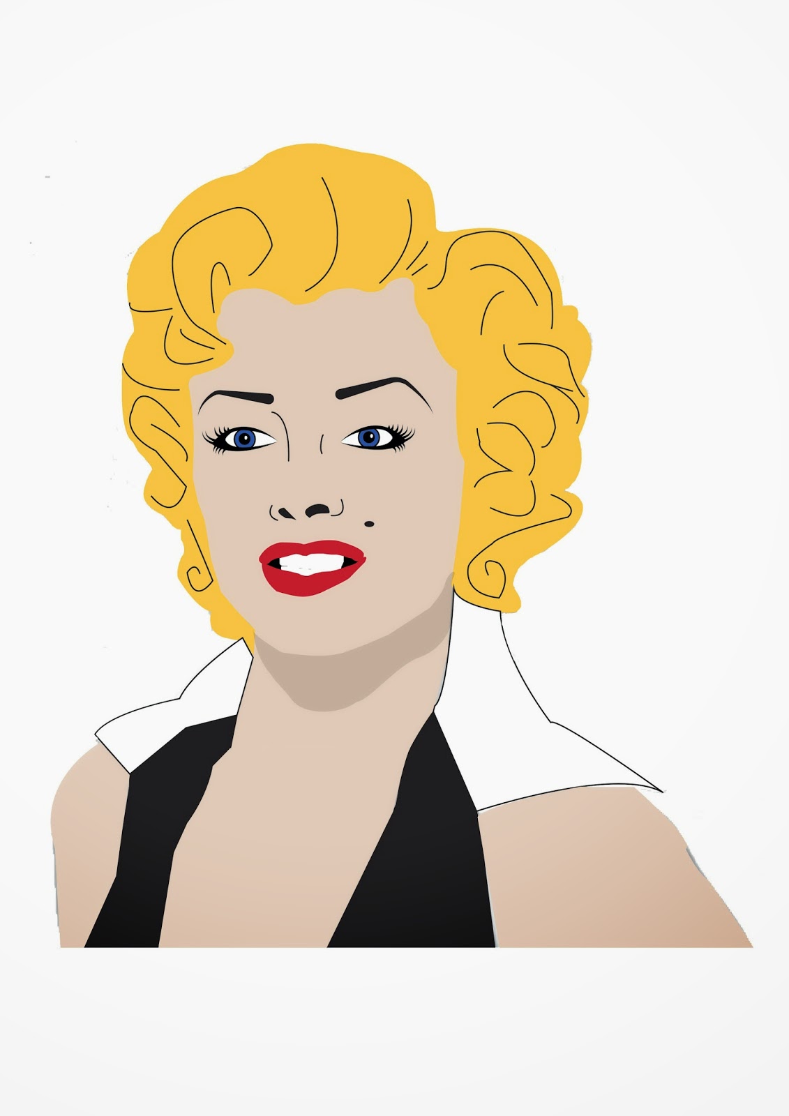
I have created this image by using adobe illustrator, using mostly the pen tool, the eyedropper tool, the ellipse tool and fill. I think the hardest bit was the eyes and the eyebrows as it was hard to get the placement right and I had to change the profile of the shape I created for the eyebrow and the eyelashes. I am pleased with the outcome as it does resemble the very iconic Marylin Monroe and it like the colours and the shadow I created under the chin.
Saturday, 29 November 2014
Friday, 21 November 2014
Urban Typography
URBAN TYPOGRAPHY
our aim was to create a collaborative urban type installation, designed from location photography taken in huddersfield. we used all the letters in the alphabet with a materialistic theme and printed the pictures on acetate and placed them on the glass window to create a wall of type which will let light pass through to highlight the letters.
After Effects: first making of video
The window in the top right hand
corner is where you import the images and the copyright free audio. We first
imported the audio and then we dragged the audio down into the window at the
bottom, we did this with the images after we made layers of colours, which
would be replaced by the images or placed in between.
This is where you can play back
your video you are creating and also you can use this buttons to repeat,
forward and reverse the video. This allows you to analyse your on work while
creating it.
Where the red line is you can move
the icon at the top and press the asterisk to make a marker at the top help you
know where the beat of the audio is and therefore line up the pictures with the
beat so it flows better. You drag the purple bar to left or right to move when
the pictures are to appear.
Tuesday, 11 November 2014
Tim Marrs
Tim Marrs is an excellent designer who uses layers and layers of different pictures, colours, symbols and give a unique textured look. there seems to be a colour scheme in each picture he creates and within this colour scheme there is one defining colour that makes the visual more striking.
typography
I love the typography visuals David Carson creates, he uses textures, letters and numbers mostly in black, white and red to really make his work stand out and look interesting. he can manipulate the shape of words to create different shapes and actually make it look like the type is moving.
Friday, 7 November 2014
Steps to create the "tree in a bulb" in Photoshop
Step 1: You have two separate pictures of a light bulb and a screw, first line the screw up with the light bulb, and create a layer mask of the screw layer and use the brush tool to rub out the unwanted lines from the picture of the screw inside the bulb. Then add a new layer, name it clean up and use the eraser to get rid of the black in the background. Create another layer and use the patch tool get rid of the metal rods in the light bulb and other marks.
Step 2: Now you have an image of a stick and you need to add a mask layer to the stick layer and erase the background of the stick image. Also you have a picture of a tree top, add a mask layer to this and using the brush tool rub out the trunk and branches to leave the leaves, reposition the tree top so it looks like the stick is holding it up.
Step 3: Duplicate the tree top layer you've just done and resize and warp the image to make it fit the thin part of the light bulb to create a shadow shape and then add a layer mask to it and use the brush tool to erase the tree that's outside the light bulb still and to merge the tree into the background to create a shadow. Repeat this again on another duplicated layer of the tree but do it at the top of the light bulb. you can change the colour of the tree by selecting its layer and changing its hue and saturation( command u).
Thursday, 6 November 2014
Wednesday, 5 November 2014
Poet
...
And in these dark cells,
packed street after street,
souls live, hideous yet—
O disfigured, defaced,
with no trace of the beauty
men once
held so light.
Can we think
a few old cells
were left—we
are left—
grains of
honey,
old dust of
stray pollen
dull on our
torn wings,
we are left
to recall the old streets?
Is our task
the less sweet
that the
larvae still sleep in their cells?
Or crawl out
to attack our frail strength:
You are
useless. We live.
We await
great events.
We are
spread through this earth.
We protect
our strong race.
You are
useless.
Your cell
takes the place
Of our young
future strength.
Though they
sleep or wake to torment
and wish to
displace our old cells—
thin rare
gold—
that their
larve grow fat—
is our task
the less sweet?
Though we
wander about,
find no
honey of flowers in this waste,
is our task
the less sweet—
who recall
the old splendour,
await the
new beauty of cities?
The city is
peopled
With
spirits, not ghosts, O my love:
Though they
crowded between
And usurped
the kiss of my mouth
their breath
was your gift,
their
beauty, your life.
Poet H.
D. 1886–1961
POET’S
REGION U.S., Mid-Atlantic
SCHOOL
/ PERIOD Imagist
Subjects Social Commentaries, Cities & Urban Life, Class
This
poem has inspired me to think of how cities are different to each other and how
this difference relates to the different types of people who live within each
city and their influences to make the city different or more beautiful with
structures of architecture and culture. But as time has passed the cities which
were once great have become darkened and lost its beauty.
Signage
Signs
are a big part of visual language within the city, they suggest directions,
speed limits, warnings and instructions for road users. There are so many signs
around the city, signs can be used as a whole project on its own but they can
also contribute to idea of a journey throughout the city. You can also compare
old signs to new signs and how they differ over time.
Subscribe to:
Posts (Atom)